Sunday, October 18, 2009

HDR and the OC Auto Show...'nuff said


Love them cars. Enough to start an auto blog. Naming it is the question. "FrazGOES" is used over at metblogs and already has a snazzy logo. I considered "auto meanderings" and decided that wasn't quite right. Suggestions from facebook friends suggested "frazgo-agogo", and "frazgo goes". Ideas from you?

Thursday, October 01, 2009

Cars and HDR are a good combo


I like HDR work and cars. It lets you tame the demons of highlight and shadow so you see the whole car and nothing but the car, turn it surreal or who knows what via the simple magic of a PC, and an HDR/tonemapping program.

I still prefer Photomatix as the program of choice for both HDR Generation and tone mapping. In particular the HDR files are much better aligned and easier to work with than those done in Photoshop using the "merge to HDR" function.

The car you see isn't available for sale in the US yet. Give it another 6-8 months and you will see it. It is the 2011 Ford Fiesta slated to fill the sub-compact gap in the Ford line up. It will be a premium small car, IE High content, good quality materials and workmanship. The prototype I drove is near production ready so I think if the driving feel transfers with the great design of this car they will have a hit on their hands. I'll reserve final judgement for when I get my hands on the real deal next year.

How did I come about this chance to photo and blog the car. I've got connections at Ford's Premier Auto Group based in the OC. I contact them and when they have a free car they will let either deliver it or I will pick it up. I get free acess to cars and share my images with them for internal publications only. A win in terms of portfolio building and networking that I hope to parlay into photo for money of automobiles somewhere along the line.

In the interest of integrity I do have to acknowledge that for this shoot the Ford rep did pay for lunch as the shoot went into the lunch hour. (Great conversation, learned a lot about Ford and the direction it is moving).

Sunday, September 20, 2009

More from the Atomic Flash series


I'm still working on the series. I love the nonchalant character on the mobile while the others are busy building what would appear to be a wall of some sort.

This was purposefully shot bracketed with HDR generation in mind. The HDR file was generated within Photoshop CS2 and then tone mapped in Photomatix. The color was left as is from the diorama which only adds to the bizarreness of the final image.

Friday, September 11, 2009

Not all images work being Autochromed


This one did. I think getting into the burn area may just yield some interesting images. Maybe.

Thursday, September 03, 2009

As close as I've gotten so far with the Autochroming


I like these images, you will need to click them to make them bigger to get full effect of the images. Of course the originals were done on either 4X5 inch or in extremely rare cases 8X10 inch glass plates you do get a good feel for the originals. What I can't duplicate so far is the black outlines around the individual color grains that the originals had, but even without these are fairly close to what the Autochromes did with the subject they were recording.

I've been working on this pretty non-stop the last few days from stock images as it has been so nasty smokey and sooty outside because of the fires. Can't really go out and shoot anything in these conditions.

A lot of the steps taken in getting the image to the final for presentation come from personal taste and knowledge of what an original autochrome looks like. (I've seen them only a few times in exhibitions). The process and steps I have been using to get the results in CS2:
  1. Open and duplicate the image file you wish to use. Close the original and work from the copy only to protect the integrity of the original file.
  2. Go to adjusments->saturation/hue and reduce saturation by a factor of -25 to -40.
  3. Go to Layer->new adjustment layer ->channel mixer->ok dialogue box -> click monochrome in the final dialogue box.
  4. In layer box click on background box. Hit CTRL+Alt+J. The new layer dialogue box that comes up label it "noise" and in mode drop down chose "Color".
  5. Go to Filter-> noise ->add noise-> check gaussian blur ->chose factor of 20%
  6. Go to Filter->blur-> gaussian blur and chose factor of 7 to 10 pixels
  7. Go to Filter->pixelate->mossaic-> chose cell size of 7-10.
  8. Go to Filter->pixelate->pointillize->chose cell size of 7-10
  9. Go to Layers bar, click on channel and go to the blending bar. I typically use "Soft light" or "Pin light" for the blending that produces the most accurate feel of an Autochrome, but others can work well too. Both of these images I used "soft light".
No I hope with this set of instructions I've helped prevent someone from reinventing the wheel. Should I figure out how to outline the individual "grain" cells in black I'll post it here.

Monday, August 31, 2009

Autochrome duplication closer thanks to google


This weekends Art Walk gave me a bit of a surprise. What sold was the few new pieces done ala Autochrome. This energized me to keep digging and hope that I get closer to duplicating the look and feel of them in the digital realm.

I don't know why I didn't check google first for a "recipe" to duplicate the Autochrome in photoshop, but I could have saved myself some time. A quick search yielded a nifty for CS4 version on how I can duplicate the look. You can find the linkHERE. It works pretty well and got me closer to what I wanted than before.

What they did that I hadn't been doing was adding a few layers with noise before adding in the changes to a color layer. In all am very satisfied with the results. It still doesn't give the dark black spots and splotches of the original, but it is overall a very acceptable result. To get maximum effect you can click on the pictures here for larger versions.

I am pleased with the progress. The debate on how I want to proceed still rages in my head. Do I shoot with classic images such as used here that are "timeless" in their nature and look like the subject matter of the originals or should I move forward and shoot what I see now and document it in the look of an Autochrome. Until the smoke and haze of the current fires go away I won't be out shooting so I have time to solve that debate.

Friday, August 28, 2009

One Step closer to the Autochrome look.

I hate to say it, but if they still made the Autochrome plates I'd be first in line to a) buy them and b) buy a large format camera so I could use them. The more I research them the more I fall in love with the impressionistic renditions of the subject they produced. Amazing that even war torn France in WWI yielded stunning images for its day.

So I am torn with how to shoot, I don't want a whole lot of modern references in the images to keep that old timey look and feel. Part of me says run out and shoot the new and give it the same treatment. The debate will range internal for a bit as the next few days are pretty with stuff.

How I got to this image for those of you wanting the technical details.
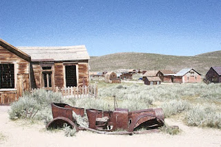
First I opened a stock image I had from Bodie CA shot a couple of summers ago. I duplicated the image and closed the original. (Never work from an original unless you want to risk accidentally saving a manipulation and losing it forever).
Next create a duplicate layer. Go to adjustments, saturation and reduce the saturation on that layer by about 1/2.

While in that layer you will visit the "Filters" section a few times.
First go to Artistic and chose "paint daubs".
Second go to Artistic and chose "film grain" and chose a medium sized grain.
Third go to "Brush strokes" and chose "Ink Outline" and chose a smallish brush stroke.
Go to blending tool and scroll through options to get to "lighten". Adjust opacity and voila a pretty close rendition of an Autochrome is ready for sharing and printing.

BTW...shameless self promotion. If you don't have anything to do Saturday evening August 29, pop in to see me in Old Town Monrovia for the Monrovia Association of Fine Arts final Art Walk of the summer. Details on LA Metblogs.

Monday, August 24, 2009

I clunkered out the "Dad Car"

Nope, I didn't get a snazzy sports car. We actually got a nice responsible mid-size that fits our needs better. Its sad to see the old girl go as we had a lot of adventures in that car. Perfect vacation car. Could seat 6 which we often needed and best of all it wasn't an SUV. I probably won't miss the v8 as the Centurion, that lovely classic I have has a monster v8 and those moments I want raw power and speed I'll just take its cover off, dust it a bit and let the wind rushing over its curves finish the clean up.

Thanks to all you tax payers that helped us get the new car with the "cash for clunkers" program. Seriously, thanks.

Tuesday, August 18, 2009

Continuing the Autochrome exploration


First of all, pardon me for not giving you all a reference point for the Autochromes. What lit my fire was discovery of the site "Les Autochromes Lumiere' " which has a few hundred wonderful images from early in the last century. Those images should give you an idea of what I am trying to replicate with photoshop. The pages within the site that would best serve as a jumping point if all you want to see is the images is titled "The Revelation of Colour".

I continued to work and discard a lot of images today. Mostly because I just wasn't happy with how I was getting the effect done. Lots of notes scribbled about what worked and what did not.

An order I have come across that seems to work pretty good. Start with a duplicated layer. Start by going to the pixelate filter and chose pointillism. Next go to artistic filters, brush stroked and use the paint daub tool. Next in the multistep process is to go to artistic filters, brushstrokes again and opt for "outline in black".

Next you go to artistic again and pick film grain tool. Finally the last step is in artistic where you pic poster edges and adjust until you have some delineation and gradation within the various colors. The final step is to use the blending tool and adjust how the layers interact until you get a sharp/unsharp image that fits the profile of an autochrome. Whew...a lot of steps but am liking the results so far.

This batch the color is a bit stronger than I did yesterday, but the original files were very deeply saturated to start with. What I am doing now is desaturating the color some, I *think* future explorations with flowers and other deeply saturated images I will desaturate the duplicate layer before I do the other manipulations.

Enjoy today's explorations on the topic of preplicating Autochromes.

Monday, August 17, 2009

Replicating Autohromes in Adobe Photoshop


Today I wax poetic for another trip to Paris, of course that is all enhanced by my rediscovery of the "Autochrome" postcard collection I have. Working from some old images I've been attempting to recreated the romantic look and impressionistic feel of the old Autochromes. These are close, and worth posting for comments. They do get bigger with a click.

The Autochromes themselves were the first commercially successful color "film" process from approx 1905-1930. Auguste Lumiere was among the inventors on this process. What they did in short is come up with a process where fine potato starch grains were died, combined with lamp black (ultra fine coal dust) on a glass plate. The plate was then varnished to hold those elements then a photographic emulsion was applied. It yielded very impressionistic, not quite accurate color, but very romantic images. The images themselves up close one could see the black dots surrounding the color grains. Even viewed full frame you could still pick out the black around the color but not always pronounced in the mid-highlighted areas of the image.

In photoshop I started by working from a RAW image that I duplicated (never work from the original file) unsharpened a bit and started running through filters. Specifically after the unsharpen layer, a new layer was duplicated and a watercolor filter was applied. Another duplicate image was done and it was given the brushstroke "sumi". Then I'd use the blending tool until I got the right combination of saturation (subtle) with a combo of blurred outlines and sharp elements. That was then flattened and a final "poster" filter was applied to separate blocks of color in the sky and insert some black outlined elements in the shadows.

Not a perfect "autochrome" replication but close. Now to work on specific shooting with the process in mind and see what I can come up with while further experimenting with filters and layers to get the look even closer.

I love to experiment.

Saturday, August 15, 2009

Blog with Integrity

I joined. It makes sense. In short it means that what I write, I write out of passion for the topic, its my words, not someones press release. It means I am doing it for free, not on the take from anyone in exchange for blogging it here.

When I talk about programs I use in the production of my images it is because I own them and believe in them. Not that they were given to me nor have I been paid to review them.

As a member of the media I get invited to press events from a variety of entities. I seek out specific invites such as from the auto manufacturers because I love cars and shooting them. I'm not paid to attend these events nor am I told what opinion or review to give them. What you read are my own thoughts on the subject and more often than not will go to explaining how I got to the final image rather than a specific review of a car. (The specific reviews usually show up over at Metblogs if I have a specific link to Los Angeles that would warrant the post there).

I don't plan on ever taking a "free" program offer in exchange for a review. Of course I can't say never, but in the event that it would happen I'd divulge that information in the opening paragraph. There is a difference between editorial, advertising, advermonials and I owe it to the reader to explain should I ever go on the take. I won't, but at least you know if I do go to the dark side I'll warn you in advance.

Part of the pledge I signed to blog with integrity also includes treating others with civility. That means never attack someone for their ideas, rather disagree with the idea with facts and own opinion on the topic.

I'm a free speech advocate. I do have to mention comments here. If you don't stay on topic or try to spam me with your own site or business opportunity stuff I will delete the comments. Comment policy here is it stays on topic and is civil. End of story.

The words you see here will always be my own. Typos and all. I'll stand behind them and eat them if needed.

Monday, August 03, 2009

HDR and cars are a good combo

2010 Mazda 3 Grand Touring
2010 Volvo XC60
2010 Ford Taurus SHO
2011 Ford Fiesta (Pre-production prototype)

I'm not quite sure why, but the auto manufacturers tend to love to give you either red or silver cars for their ride/drives at press events. Arrest me red, perfect for a performance car especially when a member of the press is trying to get a feel for its potential while running it through its paces. Especially on marked routes where you can't deviate cops love to sit and wait. No, I didn't get nabbed but is a concern when in a red car with MI MFG plates on it.

The other color they like to give is silver. Looks great, but it is hard as hell to photo without completely blown out highlights on large expanses of the car. IT also picks up the "blue sky" too well in the shadows which makes color balancing a bugger. The latter you can only do so much with a photofilter in CS2. The former, you can actually do a lot with by bracketing your shots and generating HDR images. At that point you can get shadow detail back, but more importantly control the white clipping and keep the all white highlights smaller and more natural in apprearance.

Of course being able to control the contrast and micro contrast makes it possible to highlight the cars much more differently than a straight image. Gives you the chance to drift into the surreal too which I like to do to make the car stand out more in an illustrative manner.

All of these images were shot with low ISO (200) for minimal noise and maximum detail. They were bracketed +/- two stops from average. The RAW files were run through photomatix for the HDR file generation as well as tonemapping. The final image was put through virtual photographer to clean up the cyan hue (some were shot on an overcast morning) and give them the punch of the old uber saturated contrasty Cibachrome print material.

'Nuf said, enjoy the images from a day with Ford/Mazda and Volvo and their LA 2010 Model Reveal.

Sunday, August 02, 2009

I curated my first show...


Titled "The Body Electric" and runs through September 5 at the Route 66 Gallery here in Monrovia's Historic Aztec Hotel.

Curated by me. What a concept, but curating a show isn't that much different than merchandising. Similar styles grouped by artist gives each a lot of impact and a cohesive show. Judging by the comments I succeeded.

The Body Electric celebrates the form and movement of the human form. The art I had to chose from was really excellent so editing wasn't so much a function of weeding out the less proficient from the proficient which helped. The themes run from the realistic to the impressionistic. A little abstract. Some fully clothed, others nude (tastefully done not pron folks). I was happy with the final result.

I look forward to curating again someday. Until then I'll be content with merchandising the Paint n Play 2 Art Studio and Gallery.

Details: Route 66 Gallery, 301 W Foothill Blvd, Monrovia CA 91016 626-239-3153 (Call for daily hours of operation).

Wednesday, July 22, 2009

I broke 200,000 flickr views

Stats are nice, and this is a big number but it doesn't mean squat as I don't make a direct dime off of it.

What I do know is that my viewers fall into 3 categories. Celebutard followers, car nuts and English Rose fans. Also people like to look at the films from my MRI a lot - go figure.

What I do learn comes from comments and favoriting of images in my sets. That information becomes invaluable in helping me determine which images are framed and sorted for shows and which are simply sleeved for future sales from the files.

I know I can count on 200 views a day more or less. I am found from a variety of sources. Most are google searches, some are from bookmarks, others are from my flickr friends who watch my stuff on an RSS Feed.

Nice to know that some of my images can stop people in their tracks and go hmmmm...

A little stroll along a running river


The San Gabriel River is running again. The powers that be in the Army Corp of Engineers that control the flow of the river opened up the spigot upstream and we have a river again. With this week being the hottest of the summer it is welcome relief to be able to just hear the rushing water while walking about and taking pictures.

This image was shot bracketed for hdr post processing to allow some of the waters movement to create off register portions to accentuate the movement in the final image. OF course being able to fine tune micro-contrast and your white/black levels helps with the final image. You'll note I still like a nice clean black in an image even when I'm working with hdr which in theory would have it a dark gray and details. That stark black for me creates an more anchor point for the brain as it processes the image. The final image was washed in Virtual Photographer to give it the look of the soon to be defunct old-timey Kodachrome.

Sunday, July 05, 2009

Am strung up and hung again...Monrovia Coffee Company

Just a quick cell phone cam grab of the wall I chose to display at for the next 3 months. Nice selection of HDR, Orton, digital art and straight imagery will be up through September 30, 2009.

Stop in and check out my art as well enjoy a cup of coffee while taking advantage of their free wi-fi.

Monrovia Coffee Company, 425 S Myrtle Avenue, Monrovia CA 91016.

Monday, June 29, 2009

Las Vegas and verga


Tis what I did this last weekend, ran off to Las Vegas for some travel basketball with the youngest and just soak in some sights like a summer storm pass over the city.

The images were shot purposely with HDR post processing in mind to capture all of the sky detail, and of course let me take it down into the painterly surreal world.

Friday, June 05, 2009

Gallery Showing through 6/30/09


My run at California Wine and Cheese continues. To keep it all fresh I swapped in a couple of new pictures. Both you've seen here already but at least one is worth repeating just because I like it.

Artist Meet and Greet Reception is set for 6/19/2009 5:30PM - 8:30PM. Of course since this is at California Wine and Cheese there will be specially priced "Artist Red" and "Artist White" for the event. IF you are really adventurous and want to learn about wine and wine tasting purchase one of their flights and let the staff teach you all about wine appreciation.

California Wine and Cheese is located at 115 W Foothill Blvd, Monrovia CA 91016

Saturday, May 16, 2009

J'adore Paris - or at least the romantic memory of it


I loved my time in Paris.  Beautiful city, charming people and the sights were truly beautiful.  Small wonder it has the reputation of being one of the most romantic cities on the planet.  

In working some of the images from Paris in an impressionists style I opted for the soft romantic feel of the Orton Style rather than going back to the HDR more surreal feel.   Am glad I did.

What I am beginning to discover in working into the Orton style is that if you start with a slightly over exposed original you will keep some shadow detail.   This is important as many of the Orton style works I have seen of late kept the standard formula of mating together a regular exposed and a 1 stop over-exposed image which unfortunately yields "bullet proof blacks".  Or areas of shadow so devoid of detail they are just big blobs of black that no light penetrates.   

Since I like a full tonal range opting to go my route of overexposing the frame by 1 stop and work from the resulting RAW file alter it to just 1/2 to 3/4 of normal with the RAW Processor in CS.  I do lose a little highlight detail but gladly exchange that for huge gains in shadow detail.  Both of these images were worked that way and am pleased with the detail in the shadows while still keeping the highlights saturated with color and nominal loss of detail.  IT adds to the romance of the scene when you have that detail instead of the big black blob.

Friday, May 15, 2009

A little meander in my garden


Yesterday was a strange day, misty in the am then it cleared up fast.  I spotted a few of the Fortnight Lily aka African Iris all covered in droplets that the sun hadn't dried up and HAD to get a quick pic.  While I was at it I shot a few more of Shropshire Lass.

All of these were post processed from the RAW image data file into the Orton style.  The final images were given the look and feel of the old Cibrachrome print material from back in my dip and dunk days.

Enjoy the pics and the coming weekend!

Wednesday, May 13, 2009

Shropshire Lass the most fleeting of English Roses

It is no secret that I am a fan of the English Roses, especially those from David Austin.  This particular rose, "Shropshire Lass" is one of the few single roses that make the category.   Barely.  
Whereas most of the other English Roses will bloom repeatedly this blooms only once.  Just one fleeting day I get the most perfectly pink fading to nearly white blossoms.  Given the size of the bush (nearly5 diameter and over 6 foot tall) one would expect it to be a hardy bloomer, but its wild rose parentage in the mix interceded and allows it to bloom only once a year.   I'll take it for its fleeting beauty is so special.

Tuesday, May 05, 2009

Been busy week or so - new web is up!

My new website is up.  Its been a long time coming, but I needed to work it out with the gallery's I show in where I didn't compete with them as well as directed sales to them when they have the piece on their walls.  Everyone is happy, now to the business at hand, producing more images which is always the fun part for me.   

This image was shot in the early morning hours far up Azusa and San Gabriel Canyons along the San Gabriel River.  Early spring here means lots of green and blossoms all over the place for a short period of time.

The image is post processed from RAW in the Orton style.  The final image was washed through virtual photographer to give the look and clarity of the older Kodachrome films.

Saturday, May 02, 2009

I love HDR on a Cloudy Day

Add a little doo-wop and you could have the chorus line to some old song with that title.   The reality is that shooting on a cloudy day when you expose for subject detail you lose your sky detail.  If you shoot for sky detail, most of your shadow areas are just too dark to have any detail.  (The lede photo is the example of what happens to a "T").

The other downfall to shooting on a cloudy day can leave you with flat contrast and subdued colors.  Not necessarily a bad thing, but if you want contrast and colors that pop for some particular reason this is not the best day for shooting with straight film or single image digital.

Shooting bracketed and using a program like Photomatix to generate an HDR File allows you to capture all the subject detail as well as the drama in the sky.  It also allows you to bring in contrast and colors with depth that otherwise is lost on a cloudy day.


Thursday, April 23, 2009

Pair of English Roses

Nature has a way of giving us little gifts when we least expect it.  This bouquet was a gift from nature, two rose canes, different roses intertwined and opened almost at the same time giving me this little present next to where I park my car.

The image was shot in open shade, IE in the shade with a bright blue sky above which shifted colors.  In the old days you'd have to compensate by adding more "yellow" to your print, but with the magic of PC and great RAW processors you can just use a pull down menu to compensate.  I'm liking this whole automation thing.

The final image was post processed in the Orton style as I love the romantic impressionistic image you get at the end.  I post processed all with CS2 and Virtual Photographer.

Enjoy, "Pair of Roses".

Saturday, April 18, 2009

"Peach Blossom" ala orton

A little stroll in my garden yielded this English Rose "Peach Blossom" fully blown and ready to drop its petals.  Post processed in the Orton style from the raw file and dumbed down for ease of uploading and downloading.  Final image to be hung large format style at Paint n Play 2 Art Studio and Gallery soon.  Enjoy this teaser, see the real deal next month.

Friday, April 17, 2009

My rose got a "sport"


A sport is a new rose off an existing bush.  All hybrids are susceptible to the phenom, but it is pretty rare.  I got one on an English Rose "Golden Celebration" and it bloomed this week for the first time.

I knew something was up when the bud unfurled into this evil red multi pointed star.  Eventually each of those points opened into hundreds of feathery petals.  Very unusual as Golden Celebration is a fully cupped and doubled traditional rose.  Here it looks like a chrysanthemum or daisy on crack.  IT still SMELLS like Golden Celebration, just took on a new form.  

Regardless, it is interesting and I may just contact the Huntington Library.   They have a large collection of English Roses including one called "Huntington's Hero" that was a sport from the English Rose "Hero".  Never know, maybe they'd want to propagate.  We could call it "fraz's celebration" since it sported of my plant.  Maybe, or the ego just needs to be reeled in.

Wednesday, April 08, 2009

Its not the size of the tool...its how its used

Just like the bad old saying goes, its how you use the tool.  In this case the only camera I had handy was the trusty cell phone and I used it to grab a quick pic of Monrovia High School when I was by earlier today.    The play of shadow and highlights is what caught my eye the way it all framed the old Bell Tower at MHS.  I had to take the pic.

Of course the images are just passable but post processing in the orton style and using virtual photographer to clean up the color and contrast and voila I have an image I like.  Hope you do too.

Monday, April 06, 2009

Twas a nice spring afternoon to play with orton


Yesterday after a basketball tournament wound up at the Y I had a bit of time to just enjoy Recreation Park here in Monrovia.  Just soaking in the late afternoon sun and enjoying all the brilliant green of spring was enough.

I grabbed this pic with the trusty "fam cam" a casio EXilim 10.1 megapixel point and squirt then gave it the orton treatment.  Enjoy "Rec Park Afternoon".

Wednesday, April 01, 2009

Bearded Iris ala Orton

Among the garden flowers I think the Bearded Iris, sometimes called the "Siberian Iris" is the most attractive if not outright sultry and sensual.  I love the deep rich blues and purples contrasting with the yellow "beard".  All told its pretty risky business for a "g-rated" blog.  

This lovely was done in the Orton style.  I'll give you the steps I used to get to the final image.

The image was shot bracketed to allow for the dark backgrounds and sunlit petals.    Turns out the 1 stop over was the better exposure to work with from RAW so there was the starting point.

In photoshop open your RAW file and do what you need to do IE exposure fine tuning, color and light temp balancing and contrast.  When you have an image you like create the new file.   From that file "Duplicate image" and give it a name.  Close the original file to prevent accidentally working it and losing the original data.

From the newly named file go to "Layer" and create a duplicate layer.  That is automatically labeled background which you can leave as is.  

With the new layer go to Image, adjustments and chose the exposure tab.  Increase the exposure by a factor of 1.  

The next step is to go to Image, adjustments, saturation and adjust your saturation upwards.

The next step is to add the blur to the layer.   To do this go to Filter, Blur and chose Gaussian blur.  Blur by a factor of 10-25 pixels to get to a blur that suits your eye.  I generally am in the 15-18 range and this one was 15 pixel blur.

From this point use the blending tool to determine how the final blending will look.  I used Multiply and typically do.  However, others such as saturation and linear burn turn up some pretty interesting results, in short experiment until you get the one you want.

Save the entire file as a PSD file at this point.

Now take this file, go to layer and hit merge visible.  Fine tune your levels manually by going to image, adjustment, levels.

At this final point you "save as" with some sort of notation like v2 after the name as a jpeg file that you can publish or use to work with in other files.

This image had one additional step to give it the old 'chrome look printed on cibachrome by running it through Virtual Photographer.

Enjoy the image, use the steps at will to create your own "Orton style" images.

Tuesday, March 31, 2009

I got one in! "SGV BIKERS" to show at UCR/California Museum of Photography


I sat on pin & needles for 2 days but I finally got word.  Am image of mine will show all of April at the "California Museum of Photography" at the UC Riverside Campus.  Am so jazzed one was chosen.  Now to clear out time to make it to the reception on Thursday.  The official notice:
Thank you! 

For your work to EXTREME PLACES 2009. Judging was extended due to the sheer beauty, wit, and richness of the images received. It was very difficult to choose. 

A reception will take place on Thursday April 2nd, 6:00-7:30 to open the exhibition. Thirty-three works were chosen to exhibit in our Digital Studio Gallery here at UCR/CMP throughout the month.

During the reception there will be a slide presentation where one work by each artist submitting will be shown -- along with a complimentary DVD featuring each artist given out. We hope to see you on Thursday!

Reggie Woolery
Director of Digital Studio
& Education Outreach, UCR ARTSblock
UCR/California Museum of Photography
http://www.cmp.ucr.edu


Saturday, March 28, 2009

Totally. F'ing Jazzed - all three are finalists!


All three of these images were submitted to the UC Riverside's Gallery for consideration in their "Extreme Places 2009" show set to run  for 3 weeks starting 4/2/09.  All three are finalists.  Now to impatiently sit out the judging and wait for the announcement of the winners on March 30.  Enjoy "Snow Squall", "Lario Trail Bicyclists" and "Abandoned Church Paris".