Monday, August 31, 2009

Autochrome duplication closer thanks to google


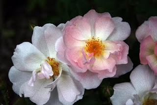
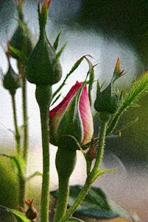
This weekends Art Walk gave me a bit of a surprise. What sold was the few new pieces done ala Autochrome. This energized me to keep digging and hope that I get closer to duplicating the look and feel of them in the digital realm.

I don't know why I didn't check google first for a "recipe" to duplicate the Autochrome in photoshop, but I could have saved myself some time. A quick search yielded a nifty for CS4 version on how I can duplicate the look. You can find the linkHERE. It works pretty well and got me closer to what I wanted than before.

What they did that I hadn't been doing was adding a few layers with noise before adding in the changes to a color layer. In all am very satisfied with the results. It still doesn't give the dark black spots and splotches of the original, but it is overall a very acceptable result. To get maximum effect you can click on the pictures here for larger versions.

I am pleased with the progress. The debate on how I want to proceed still rages in my head. Do I shoot with classic images such as used here that are "timeless" in their nature and look like the subject matter of the originals or should I move forward and shoot what I see now and document it in the look of an Autochrome. Until the smoke and haze of the current fires go away I won't be out shooting so I have time to solve that debate.
Friday, August 28, 2009

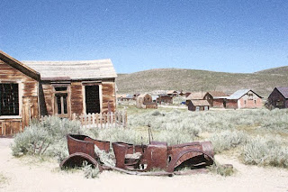
One Step closer to the Autochrome look.

I hate to say it, but if they still made the Autochrome plates I'd be first in line to a) buy them and b) buy a large format camera so I could use them. The more I research them the more I fall in love with the impressionistic renditions of the subject they produced. Amazing that even war torn France in WWI yielded stunning images for its day.

So I am torn with how to shoot, I don't want a whole lot of modern references in the images to keep that old timey look and feel. Part of me says run out and shoot the new and give it the same treatment. The debate will range internal for a bit as the next few days are pretty with stuff.

How I got to this image for those of you wanting the technical details.
First I opened a stock image I had from Bodie CA shot a couple of summers ago. I duplicated the image and closed the original. (Never work from an original unless you want to risk accidentally saving a manipulation and losing it forever).
Next create a duplicate layer. Go to adjustments, saturation and reduce the saturation on that layer by about 1/2.

While in that layer you will visit the "Filters" section a few times.
First go to Artistic and chose "paint daubs".
Second go to Artistic and chose "film grain" and chose a medium sized grain.
Third go to "Brush strokes" and chose "Ink Outline" and chose a smallish brush stroke.
Go to blending tool and scroll through options to get to "lighten". Adjust opacity and voila a pretty close rendition of an Autochrome is ready for sharing and printing.

BTW...shameless self promotion. If you don't have anything to do Saturday evening August 29, pop in to see me in Old Town Monrovia for the Monrovia Association of Fine Arts final Art Walk of the summer. Details on LA Metblogs.

Monday, August 24, 2009

I clunkered out the "Dad Car"

Nope, I didn't get a snazzy sports car. We actually got a nice responsible mid-size that fits our needs better. Its sad to see the old girl go as we had a lot of adventures in that car. Perfect vacation car. Could seat 6 which we often needed and best of all it wasn't an SUV. I probably won't miss the v8 as the Centurion, that lovely classic I have has a monster v8 and those moments I want raw power and speed I'll just take its cover off, dust it a bit and let the wind rushing over its curves finish the clean up.

Thanks to all you tax payers that helped us get the new car with the "cash for clunkers" program. Seriously, thanks.

Tuesday, August 18, 2009

Continuing the Autochrome exploration


First of all, pardon me for not giving you all a reference point for the Autochromes. What lit my fire was discovery of the site "Les Autochromes Lumiere' " which has a few hundred wonderful images from early in the last century. Those images should give you an idea of what I am trying to replicate with photoshop. The pages within the site that would best serve as a jumping point if all you want to see is the images is titled "The Revelation of Colour".

I continued to work and discard a lot of images today. Mostly because I just wasn't happy with how I was getting the effect done. Lots of notes scribbled about what worked and what did not.

An order I have come across that seems to work pretty good. Start with a duplicated layer. Start by going to the pixelate filter and chose pointillism. Next go to artistic filters, brush stroked and use the paint daub tool. Next in the multistep process is to go to artistic filters, brushstrokes again and opt for "outline in black".

Next you go to artistic again and pick film grain tool. Finally the last step is in artistic where you pic poster edges and adjust until you have some delineation and gradation within the various colors. The final step is to use the blending tool and adjust how the layers interact until you get a sharp/unsharp image that fits the profile of an autochrome. Whew...a lot of steps but am liking the results so far.

This batch the color is a bit stronger than I did yesterday, but the original files were very deeply saturated to start with. What I am doing now is desaturating the color some, I *think* future explorations with flowers and other deeply saturated images I will desaturate the duplicate layer before I do the other manipulations.

Enjoy today's explorations on the topic of preplicating Autochromes.

Monday, August 17, 2009

Replicating Autohromes in Adobe Photoshop


Today I wax poetic for another trip to Paris, of course that is all enhanced by my rediscovery of the "Autochrome" postcard collection I have. Working from some old images I've been attempting to recreated the romantic look and impressionistic feel of the old Autochromes. These are close, and worth posting for comments. They do get bigger with a click.

The Autochromes themselves were the first commercially successful color "film" process from approx 1905-1930. Auguste Lumiere was among the inventors on this process. What they did in short is come up with a process where fine potato starch grains were died, combined with lamp black (ultra fine coal dust) on a glass plate. The plate was then varnished to hold those elements then a photographic emulsion was applied. It yielded very impressionistic, not quite accurate color, but very romantic images. The images themselves up close one could see the black dots surrounding the color grains. Even viewed full frame you could still pick out the black around the color but not always pronounced in the mid-highlighted areas of the image.

In photoshop I started by working from a RAW image that I duplicated (never work from the original file) unsharpened a bit and started running through filters. Specifically after the unsharpen layer, a new layer was duplicated and a watercolor filter was applied. Another duplicate image was done and it was given the brushstroke "sumi". Then I'd use the blending tool until I got the right combination of saturation (subtle) with a combo of blurred outlines and sharp elements. That was then flattened and a final "poster" filter was applied to separate blocks of color in the sky and insert some black outlined elements in the shadows.

Not a perfect "autochrome" replication but close. Now to work on specific shooting with the process in mind and see what I can come up with while further experimenting with filters and layers to get the look even closer.

I love to experiment.

Saturday, August 15, 2009

Blog with Integrity

I joined. It makes sense. In short it means that what I write, I write out of passion for the topic, its my words, not someones press release. It means I am doing it for free, not on the take from anyone in exchange for blogging it here.

When I talk about programs I use in the production of my images it is because I own them and believe in them. Not that they were given to me nor have I been paid to review them.

As a member of the media I get invited to press events from a variety of entities. I seek out specific invites such as from the auto manufacturers because I love cars and shooting them. I'm not paid to attend these events nor am I told what opinion or review to give them. What you read are my own thoughts on the subject and more often than not will go to explaining how I got to the final image rather than a specific review of a car. (The specific reviews usually show up over at Metblogs if I have a specific link to Los Angeles that would warrant the post there).

I don't plan on ever taking a "free" program offer in exchange for a review. Of course I can't say never, but in the event that it would happen I'd divulge that information in the opening paragraph. There is a difference between editorial, advertising, advermonials and I owe it to the reader to explain should I ever go on the take. I won't, but at least you know if I do go to the dark side I'll warn you in advance.

Part of the pledge I signed to blog with integrity also includes treating others with civility. That means never attack someone for their ideas, rather disagree with the idea with facts and own opinion on the topic.

I'm a free speech advocate. I do have to mention comments here. If you don't stay on topic or try to spam me with your own site or business opportunity stuff I will delete the comments. Comment policy here is it stays on topic and is civil. End of story.

The words you see here will always be my own. Typos and all. I'll stand behind them and eat them if needed.

Monday, August 03, 2009

HDR and cars are a good combo

2010 Mazda 3 Grand Touring
2010 Volvo XC60
2010 Ford Taurus SHO
2011 Ford Fiesta (Pre-production prototype)

I'm not quite sure why, but the auto manufacturers tend to love to give you either red or silver cars for their ride/drives at press events. Arrest me red, perfect for a performance car especially when a member of the press is trying to get a feel for its potential while running it through its paces. Especially on marked routes where you can't deviate cops love to sit and wait. No, I didn't get nabbed but is a concern when in a red car with MI MFG plates on it.

The other color they like to give is silver. Looks great, but it is hard as hell to photo without completely blown out highlights on large expanses of the car. IT also picks up the "blue sky" too well in the shadows which makes color balancing a bugger. The latter you can only do so much with a photofilter in CS2. The former, you can actually do a lot with by bracketing your shots and generating HDR images. At that point you can get shadow detail back, but more importantly control the white clipping and keep the all white highlights smaller and more natural in apprearance.

Of course being able to control the contrast and micro contrast makes it possible to highlight the cars much more differently than a straight image. Gives you the chance to drift into the surreal too which I like to do to make the car stand out more in an illustrative manner.

All of these images were shot with low ISO (200) for minimal noise and maximum detail. They were bracketed +/- two stops from average. The RAW files were run through photomatix for the HDR file generation as well as tonemapping. The final image was put through virtual photographer to clean up the cyan hue (some were shot on an overcast morning) and give them the punch of the old uber saturated contrasty Cibachrome print material.

'Nuf said, enjoy the images from a day with Ford/Mazda and Volvo and their LA 2010 Model Reveal.

Sunday, August 02, 2009

I curated my first show...


Titled "The Body Electric" and runs through September 5 at the Route 66 Gallery here in Monrovia's Historic Aztec Hotel.

Curated by me. What a concept, but curating a show isn't that much different than merchandising. Similar styles grouped by artist gives each a lot of impact and a cohesive show. Judging by the comments I succeeded.

The Body Electric celebrates the form and movement of the human form. The art I had to chose from was really excellent so editing wasn't so much a function of weeding out the less proficient from the proficient which helped. The themes run from the realistic to the impressionistic. A little abstract. Some fully clothed, others nude (tastefully done not pron folks). I was happy with the final result.

I look forward to curating again someday. Until then I'll be content with merchandising the Paint n Play 2 Art Studio and Gallery.

Details: Route 66 Gallery, 301 W Foothill Blvd, Monrovia CA 91016 626-239-3153 (Call for daily hours of operation).