Sunday, July 31, 2011

A little artistic diversion for a Saturday night

Saturday 7/30 was one of the Monrovia Association of Fine Arts' Art Walks. As part of the infotainment fellow artist member Heather Shaw and I teamed up for a painting swap-a-thon. A Swap-a-thon is a team painting where we take turns adding layers upon layers of paint to a canvas until we come to a final painting. The process takes a couple of hours and is fun for us as artists as well as entertaining and educational for those watching us on the sidewalk as we do our painting.


We don't work from a picture or a scene in the street. It is purely an exercise in painting from imagination. The final painting is always a surprise to us as one never knows what twists will take place when the swap takes place. Eventually you hit the zone where you are putting in final details and you are done.

Friday, July 29, 2011

A little before and after Autochromed

Before image in HDR
After ala Autochrome

This morning I was going through images I wanted to autochrome and decided to put together a before and after example for you to be able to compare. I wanted to show how much the process does alter the image and how close I do get to recreating the look and feel of an Autochrome.

The full steps I took here for those who want to geek out with me HERE. There is quite a bit of artistic license involved in the process to get to the final image, particularly in the masks to put parts of the image and edges out of focus as well as the darkening of the edges. I'm getting better control of those two variables than I had been when I first started this exploration.

Enjoy the two versions of "Vanishing Trail".

Thursday, July 28, 2011

Just a little more geeking out ala autochrome.


This image works better for a lot of reasons. To start it was done with a low-res (2Megapixel) point and squirt from that I had shortly after the turn of the century. (Doesn't that make things sound realllly old). Anyway, its easier to dumb down and lower resolution etc., with an image that was already that way than from an ultra-high-resolution that you get from a DSLR.

Enjoy Jalama Beach from the archives of course now in its low res grainy autochrome effect.

Wednesday, July 27, 2011

Still geeking out on the Autochromes


"Foggy Morning" started out as a high res, beautifully saturated Kodachrome from years gone by. A quick scan-a-roo and its digital and ready for some magic. Magic in the form of Adobe CS5 and a few layers of manipulations to get it to an old timey low res Autochrome wannabe. Steps HERE to replicate with your own images.

Sunday, July 24, 2011

Autochromes explained, the video


A short little video explaining Autochromes from idea to final product with some interesting examples. Don't ya just love the educational value to YouTube too?

Autochrome 3 ways

White Roses
Mt Rushmore
Mary At Santa Inez Mission

A few more worked in the Autochrome style from some hi-res digital files. Details to replicate yourself HERE. All do get bigger with a click.

I believe Mt Rushmore is the least successful of the trio. Why? Well there is too much rich grays, I could have reduced the contrast a bit I suppose but when doing so things fell just too flat. Included it just as an example of a sky that worked well enough.

Enough of this for one morning, its off to Harry Potter and the Deathly Hallows Part 2 in a bit.

Saturday, July 23, 2011

Closer still...wish I had a real one to share with you.


Love the autochromes, been obsessed with them actually since I first learned of them in Popular Photography magazine WAAAAAY back in my college years. There aren't any images I can find easily with a "Creative Commons" license, but can share this link to the gallery of images at the American Photography Museum of Photography's show from a few years back. Maybe that will help inspire others to understand the passion I have for those old images.

In looking back at the collection in that gallery one thing that jumps out is the saturation level of colors varied quite dramatically. Some lost all blues, others had them very saturated. Gives me leeway in my exploration of the process in CS5.

As discussed the other day I've discovered that a sky without a lot of detail works better in creating the feel of the originals. I'm happier with this image than with some of the other landscapes.


The steps I took to get this image HERE.

Friday, July 22, 2011

Angeles Forest Bridge ala autochrome


I'm having fun with this process. Now to figure out how to "shoot" for maximum effect when I do go out next. Less sky seems to be the important part of the equation as one doesn't get as much of the effect in sky as one does in the mid-tone ranges. Plus the blue skies are still too blue for the autochrome look to be successful...in real life autochromes the skies tended to white out more than I can do in CS5. Ah, the foolery one must do to make an authentic image.

I like this image still even if it does have too much sky detail in it.

The complete range of steps HERE.

Thursday, July 21, 2011

Cactus ala autochrome


Using the steps I outlined the other day I created this low res grainy "autochrome" for a hi-res digital image. Am glad I took some tutorials as they have opened up some new doors for me to explore in the world of impressionism.

Thursday, July 14, 2011

Down the Autochrome path today.


It would appear I suffer from Adult ADHD, but I really don't. I've loved Autochromes since I first saw them many years ago. Why? Because of their wonderful impressionistic, almost pointillism images they produced. Its a recurring theme with me, impressionism whether I do it in orton, lomo or autochrome style its all about recapturing that movement from over 100 years ago in the art scene in my images today.

The tutorials I've taken in recent days for Lomo gave me new ideas for recreating Autochromes in all their low res glory from high res, beautifully saturated digital images. These two images I am happiest with as they are much closer in look and feel of an Autochrome than I have been able to recreate in the past.

To break it down into steps for Adobe's CS5 you need to analyse closely what the images were all about. Interestingly their range of image topic was wide, but most focused on tablescapes or grand scale landscapes. There were plenty of portraits done too...but that isn't my bailiwick so we'll move right past that.

First the photographers of the Autochrome era worked with large format cameras with questionable optics. IE narrow depth of field and lenses that created vignetting in terms of edge sharpness and lower light transmission. Secondly the Autochrome was a contrasty film with lost detail in both highlights and shadow leaving a narrow range of grays it can capture. Saturation was low, but the vibrancy of the range of color it could capture was a bit exaggerated. Color shifts were pronounced with blues and red getting more dominance and accuracy than the greens. Blues overtook the shadows more so than any other color. Grain was an issue for them that they used to their advantage in my not so humble, those large dyed grains of potato starch were perfect for creating that pointillist capture adding to the impressionistic view mirroring what was going on in the fine art world of the time.

So here are the steps one must look at doing to create these images. Of course each step will be explained in detail after the list.
1. reduce saturation while increasing some vibrancy in the mid ranges
2. Reduce highlight/shadow detail
3. vignetting with slightly darker and out of focus edges
4. grain

First area to recreate. Open RAW file and adjust the exposure downward, increase clarity and vibrance moderately. Drop black detail to zero. Click OK and open file. Go to adjustment bar and click add gradient map, select Black&White by clicking on the slider bar that appears at top. Chose overlay and adjust to approx 50% opacity. Merge levels.

For the second area in the process go to to the adjustments bar and click levels. Adjust black slider to right to darken shadows more. Adjust highlight tab to left to brighten whites losing some detail. Return to adjustment bar and chose curves. Adjust Red and Green to increase in highlights and decrease in shadow slightly. Adjust blue to increase shadow and decrease slightly in highlights. Go to adjustment bar and click on Vibrancy, significantly increase your vibrancy by moving slider to right. Merge levels. You now have a reduced saturation slighty off color version of the original.

The third area to look at needs a couple of steps. Adding vignette of darker edges and out of focus will take a couple of steps to recreate. First to create the darker edges you use your polygonal lasso tool and draw out a rough oval shape in the image. Right click and chose "inverse selection. Go to adjustment bar and chose levels. Move the shadow slider slightly to the right to darken the edges. Merge layers.

Right click on the image and create duplicate layer. Go to the upper tool bar and chose filters, Blur - lens blur and move slider to right until you are moderately all out of focus but can still identify rough shapes. Click OK. Go to adjustment bar and click on mask. Using paintbrush tool set at 75% opacity and a large brush size, "paint" in your mask over central portion of the image in several strokes, building up to maximum masking at the center and none in corners. (You will notice that your center will increase in sharpness as you build up strokes while edges remain blurry). Merge layers. You now have an image that has darkened out of focus corners with a sharp focused center, center of attention.

The fourth and final area to manipulate is to add grain. Right click on your file and create a new layer. Chose a medium gray and using paint bucket add to the layer. Go to the upper tool bar, Filters, Noise, add noise. Move slider to right to an order of somewhere around 30-50% "noise". Select Overlay and adjust opacity percentage downwards to between 30-60% depending on your personal taste. Merge levels.

A lot of steps, but certainly much better results than the last process I was using. Better as in closer to resembling a true Autochrome. Now if I can just figure out how to recreate the "dots" surrounded in black like the originals I'd really be in business.

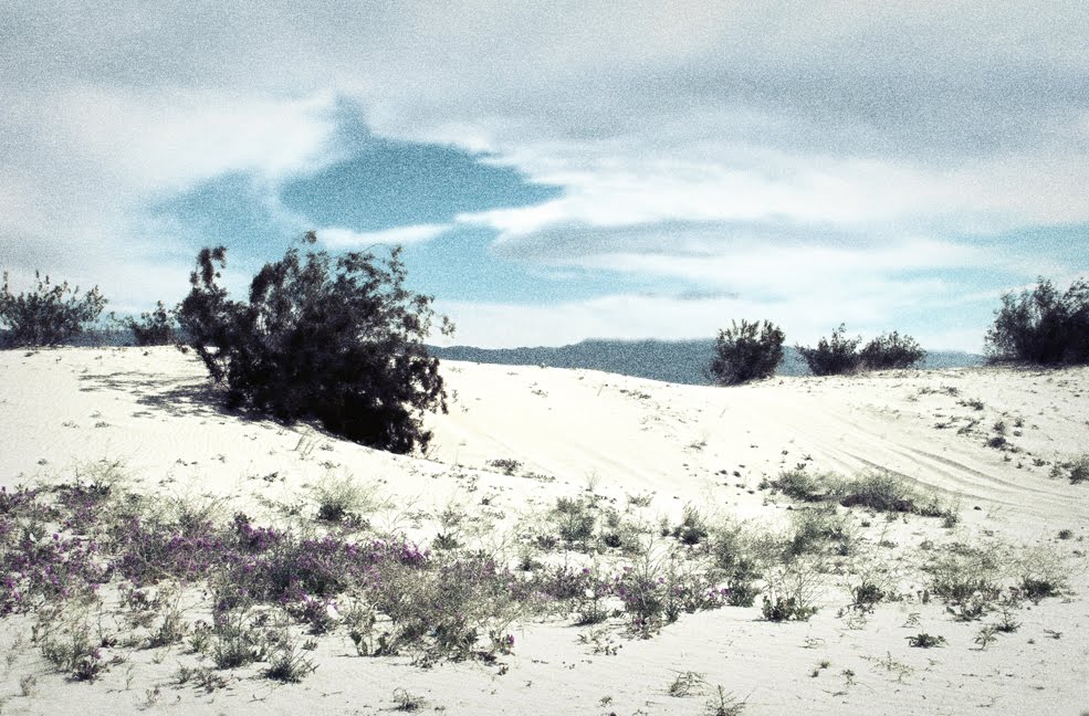
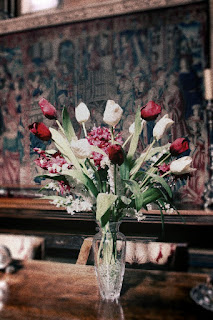
Enjoy "Tulips" and "Desert Storm"...Tulips I think is the closest to a true Autochrome in look.

Wednesday, July 13, 2011

cars cars cars and a little lomo to make them stand out more


Its no secret I love cars. Since I got on the Lomography wagon and experimenting I decided to grab a couple of car shots and use the process to highlight the cars and create a little excitement around them. The 2008 Mustang Bullitt and 2011BMW 6 series were the car shots I worked with.

A little more lomography for the morning


Still in the lomography frame of mind. Have just about got the process down where I can do the steps without thinking about it too hard. Soon enough I'll be able to just do it and focus on creating impressionistic images from a hi-fi digital with no effort at all. Still will be a bit time consuming but it won't be brain wracking.

Enjoy "Forgotten Path" and "Woodland Spring". The latter I like the image regardless if its impressionistic or realism...well worth the poison oak exposure to capture the image.

Tuesday, July 12, 2011

playing in the Lomo sandbox a bit...


A few things I'm slowly discovering. My love of dramatic cloud filled skies don't work so well in the Lomo world unless you are willing to give up on some of the vignetting in the sky. What does work best is when you have a solid sky, or a pretty much uniform background.

These three images were done today. Still have the tutorial playing in the back to guide me through the steps as they just aren't down to memory and automatic. I don't have to pause any longer while I do the steps, its just a matter of committing them all to memory. To save you the scroll the link to the tutorial is HERE.

Personally for me the Spring Bouquet worked the best of the series I worked today. The Palms loses some of the vignette in the upper right corner because of the clouds and isn't quite as effective. Similar problem with Santa Ynez Valley...edge vignetting isn't as strong in the sky as I would like.

Much to learn still but am glad I took the tutorial as it helps me better understand CS5's potential better than I had before I took it.


Monday, July 11, 2011

still on the lomo path


I love learning new things. Since stumbling upon a tutorial on Lomo have been just a bit energized with the tidbits I am learning on CS5 as well as producing Lomo style images.

In this case the Lomo process really makes it possible to allow the center to better highlight the single tree and bridge while blowing out details in the fringe. Makes it possible to give a sense of space via the negative energy on the perimeter.

I still need to learn to take a deft hand at the sharpening and unsharpening part of the process to better transition between the two. This is just a start.

Of course the learning to better control masks and adding grain has me thinking again about what I can do to make "autochrome" style images better in CS5 as well. Stay tuned for more on both counts as I meander down the impressionists path a little stronger in the coming weeks.

Sunday, July 10, 2011

A meander into the world of Lomo


Where to start. The last month or so has been spent looking into "lomography" or "lomo" for short, which produces some pretty startling impressionistic images. Many elements go into the images. First the cameras are bests described as "toy cameras" for film, yes that silver based stuff I adore still after all these years. Second they take the old outdated film for the most part that has inherent color shifts built into it. Then they cross process it...IE negative film developed in slide film chemicals or vice versa.

The end result is multi-fold shifts in the image compared to what would have happened if you were using quality optics, optimal age film and correct processing. In short its nothing like you shot and its image quality is adorable. The edges are out of focus and the light transmitted drops noticeably. The colors shift with a pronounced blue/green shift. Highlights get blown out and darks just lose all detail. Sharpness suffers at the edges with grain appearing all over adding to the impressionistic feel.

Since I'm not about to shift all of my work to film for the odd lomo image I would want to create I looked to Adobe's photoshop to help me create the look and feel of a lomo image. After fooling around with it I just couldn't get the right result on my own. I wound up starting to google search ways to create it via tutorial so I don't have to reinvent the world. I stumbled upon this excellent tutorial that takes you through the multitude of steps needed to create a lomo style image in photoshop. It is on YouTube and its possible to pause the video between steps so you can work out an image of your own.

The image here is one I purposely shot to try to lomoize. It was successful to a great degree. In the future I need to keep in mind that high contrast scenes will work best with the process. The potential for this process to work with a variety of images is pretty terrific. Of course you need to have a strong image to start with as no amount of photoshop trickery will solve bad composition and exposure.