Friday, March 02, 2007

Saturday, February 24, 2007

One last reminder, tomorrow (February 25, 2007) is the artists reception at Paint N Play, I'll be there, come see me, have some free booze and food while you are enjoying all the great art! It is from 3:30 to 6:30PM. The details:
Paint-N-Play
418 S Myrtle Ave
Monrovia, CA 91016
Wednesday, February 21, 2007

Monday, February 19, 2007


Tuesday, February 13, 2007
Exploring and telling what we saw is part of being human. Cavemen did it with the end of a burnt stick on a cavern wall in Lascaux, France were the first to document what they saw, modern man does it too with our art, written word...spread faster than ever before with the help of the 'net.
This mornings activity was to sort through the images I shot up on the Central Coast in and around San Simeon. A couple of them I worked into clearer (IE removed some atmospheric haze) photographs and once happy...deconstructed into my more impressionistic painterly images. The latter I continue to have more fun with, seeing some old Dutch Renaissance paintings added some clarity as to where I wanted to go with what I have been doing. Love both the the literal photograph and the impressionist so I run both directions in tandem.
For your viewing are 4 images. First two are of the Piedras Blancas lighthouse, the latter two are of the Santa Inez River Valley in Solvang taken from the Santa Inez Mission. In each set the first is a literal photograph with the next one as an impressionistic version. (In the light house version the differences are hard to 'cipher as the process of reducing size and pixels causes a lot of detail loss).


Monday, February 12, 2007
This past weekend was a literal journey up the coast to San Luis Obispo and Hearst Castle. The landscapes there are similar and different than here in the LA Basin as they get considerably more rain each year. Add in the castle and things get to be a bit other worldly.
I thought a lot about the old dutch masters while wandering about Hearst Castle as much of the interiors were decorated with pieces from the Rennaisance, but looked like they were the subjects of those old masters.
The one master everyone has heard of is Rembrandt though he is not known so much for landscapes as some of the others. Those that did landscapes that struck me the most were Van Goyen and Vermeer. Painters of the era were the first to include dramatic skies with clouds doing things rather than a pretty perfect blue sky. Van Goyen and Vermeer in particular struck me with the prominence they gave their skies and the drama it added to their final painting. Both also used very strong shadow elements to heighten the tension in the painting and bring more attention to the sky.
Clouds do add a lot to the sky and it something we notice even as kids trying to make out a face or shape out of the random fluff drifting overhead. I am certain early man watched the sky with the same wonder, and even fear as storms could wreak havoc on their mud huts and crops.
The land around the Castle does not even remotely resemble the flat plains and marshes of Holland. The clearing skies as a winter storm passed through the area had all the drama and play of light and shadow that the Dutch Masters so ably captured in their paintings. The setting and the sky, well it made me think of the old Masters as I went about shooting in and around the castle and San Luis. Once I got started I quickly switched lens to an ultrawide angle so I could capture more of the sky and all the shape and form the clouds added to the image unfolding before me.
The picture I am sharing is "San Luis Farm" I captured it just as the storm as breaking apart and a strong shaft of light from the rising sun illuminated some hills just past the farm. Now I'm thinking about taking it apart and doing a watercolor print with it. Imagine it with an impressionists twist, until then...enjoy the image as it stands in all its literal photographic simplicity.
Friday, February 02, 2007
Damn it has been busy around here with stuff and not able to shoot much. A new gallery has opened here in Monrovia. I am among the very first artists invited to show some work. So...4 pieces are up. The grand opening gala is scheduled for February 25 at 3:30PM.
The gallery is located right on Myrtle avenue in the middle of Old Town and will feature the artists from the Monrovia Art Festival Association.
The specifics:
Paint-N-Play
318 South Myrtle Avenue
Monrovia, CA 91016
February 25, 2007 3:30 PM
So....come see me for some free music food and hopefully...booze along with the art on display. Among the pieces I have on display is "napping snail".

Tuesday, January 23, 2007

Saturday, January 13, 2007
Don't know who I should apologize to first, those who follow my blog or myself for putting my photography aside for the last couple of months. Good reason it happened...finished up the remodel of the house. This wasn't a little paint make over, rather ripped out the entire kitchen and new put in, 2 bathrooms gutted and new put in. Ditto the patio. Some pics so you can see what was done:


Finally last night I got to go out and do a bit of shooting. I chose night time streeet photography for a reason. Am off to London and Paris in April and really want to hone this skill. I spent many years doing night work and loved the quality of light so its a circle back to an love for me. Why I had to pick one that was very cold windy I don't know, but I did.
Wandering down Myrtle Avenue during the Family Festival and Old Town Monrovia when I stumbled across the Kettle Korn store front. This place is usually pretty pristine and it makes the most incredible Kettle Korn. The scene caught my eye and I started to shoot.
I knew when I first peered in the window it was something I'd more push towards the impressionist view with after processing. To do that, you still have to have a good exposure and this scene had its challenges. Dipping back into my bag of tricks I knew that the "Zone System" so beautifully designed by Ansel Adams was the way to go to make it work.
The Zone System is a theory that simply helps you break your scene down into blocks or zones of the shades of gray from absolute black to absolute white. It gives a 10 stop range of gray. The zone assumes that the perfect neutral is an 18% gray and from there you base your exposure. You pic the zone within your scene that you want to be 18% gray, meter that area and expose as your meter readout dictates and voila the area you wanted is perfectly exposed.
The problem with this theory is you have to carefully chose what you want to be the 18% gray. Of course you better know the contrast range your capture media can record. Regardless if it is film or digital sensors each has a range it can effectively capture. If you aren't sure find your self a preprinted (Kodak used to make a great one) gray scale zoned on one side and neutral 18% on the other and take some test shots. Knowing your media limitations help you get closer to the "right" exposure for the gray scale representation you want in the final image.
Back to the problem of picking the wrong gray for your metering for 18% gray. Chose an area that is too dark you have great shadow detail but leaves your highlights completely white and lacking detail. Chose an area too light for your metering gives you great highlight details with no shadow detail. Finding the balance is where the artistry comes in. Bracketing helps you with a range of exposures around what the meter recommended to get the final result you wanted.
Now on to todays image. "Kettle Korn" was an interesting challenge. The front of this store was not lit while the back was strongly lit. There was little light from the street leaking onto the front so I had to work with backlit dark objects and a white wall in the back. A stroke of luck was the fake slate floor was there and knew it was likely a zone V or VI, metered that, used the base "f-stop" down 2 stops and shot with 1/2 stop brackets from that starting point from 1 1/2 stops eitherside of the adjusted. Make sense, it did to me at the time. The 1/2 stop under the adjusted wound up giving me the balance between shadow detail and highlight I wanted to portray. Of course I still had a little of balance work to do with Photoshop to fine tune it for the final image that I ran through the "dry brush" filter for the final image I wanted.
So there you go, even digital art you need to know your capture tool and its strengths and limitations. Bracketing helps get you closer to the ideal you envisioned when you saw the scene, digital makes that cheaper. Enjoy Kettle Korn and forgive the long silence...

Thursday, November 16, 2006
Lately there have been a series of heated debates in print, blog or other forum regarding silver vs digital imaging, and horrors~ use of computers by photographers. The really ugly stuff starts when the whole "digital art" thingy gets into the equation.
Purists moan regarding the loss of film and silver based paper...yes its happening but manufacturers do that when the market changes. ITs one of the consequences of a free market system, get a grip and deal with it. The manufacturers, Japanese in particular continue to invest tons into silver based product for the professional market. Makes sense put your efforts where the money is.
I bailed on silver based when digital was able to rival the quality and beat it at price. Let's face facts your 4gig CF card pays for itself the first time you fill it up...'cause if it were film for those 1000 images the processing bill would have killed you. I switched as I am cheap and can get the same image for less dineros. Simple as that.
Today after reading a few blogs and a letter to the editor on one of the photo magazines I subscribe too I got to thinking. What irked me was this photographer pontificating out in the sticks in "conker creek, TN" who made the switch from digital as there were no labs around. Fine can live with that. The she wrote "I have found the beauty of actually learning to use my camera - not Adobe Photoshop. I use my Cannon EOS 20D (a little elitist snob appeal??? my comment not hers) as I did my 35MM, and my work is wonderful. The best part is that it's "mine"..."
So while on my walk and enjoying the beautiful weather I thought a lot about this debate. A good image is one that has good composition, if that isn't there no amount of fiddling in an editing program will change that. You can't mask bad composition.
No program will ever let you doctor a bad image where you can call it "pseudo art" as she termed it. An image works or not based on the skill of the artists using their medium of choice. Painters do it, graphic artists do it and now digital artists do it. IF the image can't stand on its own no amount of effect can fix it. You can't apply filters without an understanding of why it works, what you want to convey with it. Couldn't do it as a painter underpainting, can't do it as a photographer for the same reasons. There has to be a method to your madness with an understanding of the final result....that comes through education, experience and practice. And in the end if the composition sucks so will the final product.
I love the realm of digital art. IT allows me to take photographs and do things with the image that it took me ages to do in the old world of dip and dunk in the lab.
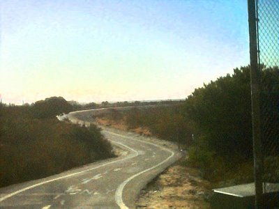
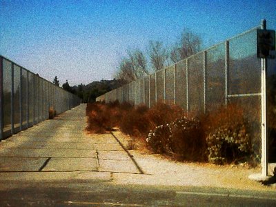
So while enjoying a glorious sunny, 85 degree day in November along the San Gabriel River I broke out the Che-ez Snap digital camera and filled up its little 25 image card with these fun little .3 mega pixel images. As I've said before...contrast control is poor, sharpness is poorer, color rendition is sketchy on a good day. It does however make you focus on composition. Which has been a theme of review and focus for me lately.
Add in the camera's artsy fartsy recording of the world as I meander through it, those images are ripe for conversion into purely "impressionistic" pieces. And that I did...
Enjoy "Bike Path" and "Duarte Bridge" for what they are. Exercises in impressionistic focus on pure composition. One works because of the sweeping lines made by man (man vs nature theme snuck in too) that forces your eye to meander through the image. In the Bridge its hard edge of man vs soft of nature forcing you to look into the image. Different composition techniques making images work. Digital art with a camera works, now leave me out of the silver vs digital debate. Here's the final Images "AND THEY ARE MINE"!!!
(If I could blow out a raspberry right now I would)

Working out some images I shot in the Bishop Creek Canyon area of the Sierra's I thought a lot about texture and energy flow. Of course this time of year there is color, lots of it which makes it even more fun to wander about and just shoot.
Autumn is a fun time to shoot as you have big bold blasts of yellows and red to create contrast and visual tension in an image. Add in natural movement of water, clouds etc., and you can set up an image that has a lot of tension and movement to stimulate your brain. How you funnel that energy is only part of how you convey what you saw at the time to the viewer.
Another factor you have to look at really closely is how you expose your image. The color of light changes during the day, if you want your yellows and reds to really pop shoot early morning or late afternoon. Where possible back light those trees and let them take on a glow that really makes them pop.
Exposing all of that is where skill comes in. Sure, you could just let your camera take an average meter of the scene and your image will more often than not be acceptable. I shot a lot of the leaves and trees bracketing 1/2 to 2/3 stop over/under what the meter said to make sure I kept detail in both highlight and shadow. I metered off the leaves themselves as I wanted to ensure maximum detail and saturation, bracketing to get the other parameters with in reason.
The end result..."Bishop Creek" which I shot later afternoon as the first winter storm (yes it snowed that afternoon) was crossing up and over the mountains around me. I got an energetic composition due to the rushing water and contrast between the cool blues of the clouding over sky against the vibrant leaves of the aspens. Even the few lone sequoia's added in contrast with their dark greens and stout upright thrusts. Am happy with the result...enjoy!
Saturday, November 11, 2006
How you use negative space, shadow vs highlights, textures impact the final product. How it all balances to create tension or relaxation are in the photographers control. Ansel Adams took balancing those items and by manipulating first in the camera, then later in the printing process adjusted how the elements within the final image he shared with us.
The subject matter often gives you ways to "frame" it with the elements around it. On a walk through the forest its the dark shadows that make the brighter elements stand out more. Contrasting texture in nature is there to help frame as well...rough edges of a stream bed vs the soft curves of the water tumbled rocks, the soft waves of grass in a field against jagged peaks in the hills on the horizon. In our cities its the hard edges of the building framing off a garden or contrasting with the flowing curves of the clouds above. So many ways to bring visual excitement to the viewer.
Of course its this excitement to the brain that brings the viewer into your image. My exploration of man vs nature continues. Elements of man framing those of nature, man's tension added to nature, the largesse of one against the other. It is all about how you compose that makes the image work and what element becomes the star.
A couple from the Santa Monica Pier exploring the relationships with different approaches to composition. First is "Watchers" which explores the steady hard edges of manmade elements against the flowing energy of the waves and weathered wood. The other is "Pier Shops" which explores the color and texture of some elements against a flawless blue sky. In the latter the natural elements add texture even though the construction created hard edges. One is an example of relaxed composition, the other of an energetic composition. Both work just for different reasons.


Friday, November 10, 2006
Today at Santa Monica Pier I continued my exploration of manmade vs nature. What better place than an amusement park at the ocean (especially on an 80 degree day in November...Had to rub it in a bit as most of the US has winter this time of the year).
Seriously an amusement park is an terrific place to go for comparing what man does vs nature. In this environment structures take on extreme form and color creating drama. This is done to make things look faster and more exciting than they really are. Compare it to nature. Here there is sublety in the mid-day sky.
One such area that contrasts man and nature is at the roller coaster. There is the soft form of the flag being blown by a soft breeze against a brilliant sky contrasting these incredibly strong forms and vibrant colors on the coaster track. Its this contrast that intrigues the eye and gives me fodder for exploration.
For your viewing pleasure...."Flag"

Or at least it does to me these days. Its about exploring shapes and sizes comparing man to nature. Who knows where this theme came from but it has been fun exploring on both levels.
An interesting theme of late is returning to a few of my older themes. Back in my college days there was the whole "full frame" shooters going on in the fine art side of the photo department. Even though I was a "commercial" track student I still enjoyed what they were doing and used it for myself.
Essentially the only rule this group worked on was that the whole frame from your negative had to be printed. It forced you into clean compositions. No cropping was allowed...ever. Several of my friends were very involved in the "full frame society" which was an informal club, more like an artistic movement within the department. The negatives were never printed using the metal masks, but in hand made cardboard masks that included the surrounding information from your negative on the final print. Those gobbly gooky numbers and letters became graphic elements in their own right as part of the final image.
It was something that appealed to me then and applied it to how I started shooting. Only on the absolute rarest of occasions will you ever see me "crop" out anything. To paraphrase a popular ad theme these days "what's in the frame stays in the frame". Without realizing it until recently I still shoot and print full frame.
On a recent walk about I stumbled across a school yard scene. It had the elements that struck me...size and man vs nature. So I shot it, and with the help of photoshop removed elements, add some impressionistic touches to others then melded it all back together again. The result...exploration of large vs small, man vs nature in "Schoolyard"
Today is shooting at the beach. Next week if I get my living room painted....up onto old Route 66 between San Bernardino and the Cajon Pass.
Friday, November 03, 2006
Oops...I almost forgot. I still have 3 pieces hanging at the Aztec Gallery located at 311 W Foothill Blvd, Monrovia. The gallery is open 5PM-9PM on Friday and Saturdays 12PM-7PM.
The gallery is a co-op so the artists showing all take turns staffing the gallery and answering questions about their art and those others showing there.
During the other days of the week you can call the Monrovia Art Festival Association at (626) 256-3124 to start making an appointment for a private showing that fits your schedule. The answering service will put you in contact with one of the members on the Executive Committee who will help arrange for an artist to open up the gallery when you can come in to the the art there. (It will likely be me as I am most flexible and closest to the gallery).
I have 3 pieces there. They represent a few of the themes I've been exploring for a while. They are "Shropshire Lass" a traditional photograph, "Half Dome" in an impressionistic watercolor photographic style, and "Alexander Rose" a hybrid watercolorphotograph and digital image.
Until then I promise to get out and explore the old route 66 relics, and not just those local icons here in Monrovia.
OK..I had to get your attention somehow. Beyond art the usual big draw seems to be free food and booze. (We can hope that Trader Joe's, corporate hq here in Monrovia comes through for us again).
The Details....Focus One Gallery, 404 E Huntington Drive, Monrovia, CA. Thursday November 9 from 5PM to 8PM. (Sorry its not later but this Monrovia and early bedtimes are the rule). It is located at the SE corner of California and Huntington Drive. From there exit either Mountain Avenue or Myrtle avenue and head north about 2 blocks to Huntington Drive. From Myrtle the Gallery is 4 blocks east on Huntington. From Mountain the Gallery is 6 blocks west. Really easy to find. Ample free parking. Did I mention Free food and FREE booze?
Anyway, my newest piece, "Bodie Blue Window" will be hanging at the Gallery through December 31, 2006.
Saturday, October 21, 2006
Consider this your invitation to the Artists reception 10/28/06 at the Historic Aztec Hotel here in Monrovia from 5-8 PM. No invitation needed, no RSVP needed. Just show up and enjoy an evening of art, munchies and cocktails with us at the Aztec. You can't miss the gallery as it is right on Foothill Boulevard about 3 blocks west of Myrtle Avenue. For you mapquest fiends the actual address is
Aztec Hotel
311 West Foothill Boulevard
Monrovia, CA 91016
I'll be there as I have pieces in the gallery as well as displayed on the sidewalk that evening as part of the event. It will be here that the newest piece from the Bodie series will be unveiled. It will be a large piece (20X30 image in a 24X36 frame). It is one I had a lot of fun working on.
The teaser thumb of "Bodie Blue Window" is attached for your viewing pleasure.
Saturday, October 14, 2006

Pun intended. The show last weekend was terrific. Not often you get to see first hand someone's reaction to your work first hand and non stop.
I was very excited that a lot of my newer works were hitting home and stopping people in their tracks, drawing them into my space for closer inspection. All told by the end of the weekend I know that the meandering path of exploring styles and exploiting the digital image is working for someone besides me. That kind of feedback is priceless. Very motivating when you have that kind of feedback.
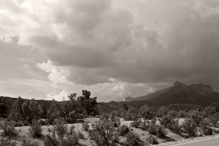
Why so long to write in here again? Well I picked up 3 commissions for larger images of what I was showing. The first is framed and ready for delivery to the Balder family in Temecula. It is a large sized print (just under 24X36 inches) of one of my favorite images. It struck a cord with them as they both grew up in Arizona and it reminded them of where they came from. The piece is "Mt Charleston Storm" and it was posted here earlier this summer. A piece I am most pleased with and certainly gains a lot in a very large format print.
Enjoy...watch for some new stuff very soon as I was invited by the director of Graphics and Printing at Santa Anita Racetrack to go in and just shoot to my hearts content, the horses and the art deco structure at the place. She saw my work at the show and liked it enough to extend the invitation. Wahoo...does it get better than this?
Stay tuned as soon as I finish up the commissions I am out shooting again!
Friday, October 06, 2006

Art from the Heart
As sappy as it may be but I firmly believe that sharing your art is as important as making a buck. Its about giving back to the community.
This weekend is the Monrovia Art Festival Association's biggest event and fund raiser. MAFA is a non-profit that donates its proceeds every year towards art education in the public schools. I firmly believe that art is a communication tool that children need as much as any other tool they are given in school. With art being cut from the elementary schools in California I am very proud to be a part of the group that earns money to give these kids this important tool. (MAFA has given nearly 100K to fund art education over the last several years).
So....this year I am donating "Old Rose" from my watercolors collection for the auction at the "Celebrate the Arts" taking place this weekend, October 7 - 8, in Library Park in "Old Town Monrovia".
"Old Rose" started as a digital image. I pulled out the rose, worked it out to soften lines and create a painterly effect, changed the background to make the rose pop better, reassembled the image and printed it on soaking wet watercolors paper. The final image is different than what you see here as the inks do float, bleed when printed giving a very painterly effect.
Enjoy the image, if you are in the park this weekend look me up!
Wednesday, October 04, 2006
Back in the day, specifically my SIU-C years there were 2 camps in the photo department. The fine-art group and the commercial group. I walked the fence on both though technically my focus at the time was the commercial side. Getting a BS sounded better was the logic at the time.
There was a movement way back then to use a camera called the "Diana" which took horribly crude photo's. The fine art group ran with it and did some really amazing things with it. Flash forward some 25 years and I found its replacement the"Che-ez" by Snap. Horrible color rendition, horrible contrast, poorly fixed focus on a plastic lens but it never leaves my belt loop. Always on the ready for what strikes my fancy as I meander through life.
It really suits my impressionistic exploration in some ways better than the EOS 20D I usually use on my shoots.
Today I happened by a local landmark, actually a pretty slick icon from Route 66's hey day getting rehabbed. Much of the building is getting painted its original colors...the sign, neon of course, is still untouched. Add in a few clouds and the whole man vs nature thing is up there to explore. Since I always have the Che-ez on my belt loop I snapped of a few frames.
Enjoy "hotel"...worked over images from the Che-ez.

P.S....stay tuned as I have still not decided which image will be donated for the silent auction this week to benefit art education the Monrovia Schools. Will post here once I decide.